Thursday
Feb042016
Ten Years of Margaret Howell and Eric Gill
Posted on  February 4, 2016 by Simon Roe
Simon Roe  01
01
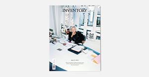
Image
—01. Three different covers.
Words
StudioSmall's work with Margaret Howell is some of the design agency's most successful, achieving a consistently beautiful balance between the client's vision and their own principles – irrespective of the medium or brief. Looking at this output overall, it's the printed invitations that often stand out, and a range of them are assembled here. The 36-page commemorative publication explores the evolution of a decade-long relationship grounded in the Gill Sans typeface, alongside a contextualising essay from Eye magazine editor and co-owner John L. Walters.


 01
01
 01
01
 02
02